


Positioning and Week Ahead [07/07]

Looking into next week, we primarily have a few bond auctions for US economic news(taken from Investing.com). Front and center this week is the July 9th Tariff extension deadline.
All times are in EST
Sunday
BRICS summit (0600)
Monday
BRICS summit (0600)
Tuesday
RBA interest rate decision (0030)
BRZL Retail Sales (0800)
NY Fed 1-Year inflation expectations (1100)
3 Year note auction (1300)
CNY CPI (2130)
Wednesday [Tariff extension day]
10-Year Note Auction (1300)
FOMC minutes (1400)
Thursday
Germany CPI (0200)
Jobless Claims (0830)
30-Year auction (1300)
Waller Speaks (1315)
Daly Speaks (1430)
Friday
UK GDP (0200)
How significant are these events?
Well, we can use the straddle pricing to see the general jumps in pricing. See below
Positioning into the next week
I’ll go over each topic and summarize how I bring all this together at the end.
If you have any questions on these topics, check out the positioning article linked below

I added some general explanations of my scanner to the Review of Positioning Metrics (Keeping everything in one place)
Topics covered
Straddles with 50/70 percent ranges
15/25/40 Delta Skew by Date
Term Structure
Net positioning (Aggregate and by day)
Technical Structure of the Market
Key zones to watch
Putting it all together
Straddles with 50/70 percent ranges

Let’s look at next week’s straddle
The straddle for this next week is ~90 pts (1.43% straddle). The largest increase in the straddle comes on 07/09. The disparity in 25 delta call/put continues to rise into Friday from 25% on Monday (29 to 38 [Inner Blue Values]) to 40% (64 to 80 on Friday).
The 90pt straddle gives us a weekly straddle range of [6189,6369]
I’m keeping both the the July and Quarterly OPEX straddles here (not We' tagged the July OPEX straddle high already).
July OPEX Straddle Range = [5755,6180]
SEP OPEX Straddle range = [5576,6360]
Let’s take the weekly high straddle and look how that compares to the SEP Q OPEX straddle high (6360)…. mhmm.
If you take a look at the inner values in the straddle snapshot above, you’ll notice the inner blue/yellow values representing 25 delta calls (yellow) and 25 delta puts (blue) are heavily favoring puts - For what it’s worth, you would think we just came out of a sharp decline given the 40% disparity in Put/Call pricing.
The outer blue/yellow values represent the additive distance of the 15 deltas for puts and calls.
The 70% Range for each day(or week) can be obtained by adding the two yellow and two blue numbers together and adding the yellow sum to the spot price to get upside range while adding the blue sum to the spot price to get downside range.
Quick example (for this week)…

Let’s compare the 70% range derived from the 15 deltas to the straddle…
70% range: [6135, 6379]
Straddle: [6189,6369]
Notice the disparity and how much more puts are being price than calls for the week?
Skew

Orientation of charts
15 delta = top (OTM) and is often the place for speculative upside/downside. It’s a bit wingy but not quite as wingy as a 5 delta.
25 delta = middle (slightly less OTM) and is often the relative delta for hedges
40 delta = slightly out of the money and is often the relative delta for directional moves
Explanation of data in charts
Gray = ATM volatility (general demand in volatility)
Yellow = Call volatility
Blue = Blue volatility
Red = Skew
Observations
ATM volatility climbs steadily throughout the first half of the week while the 25/40 delta skews show quite a bit of oscillation around July 9th.
Term Structure

Term structure (as of Friday close) is now back in the lower mid range of the past 20 days. As you can see, volatility expectations generally stair step and climb into and past OPEX (which has generally been the case for the past weeks). We’re at ATHs while the term structure climbs ever higher showing increased volatility expectations (still low). This changed quite a bit from Thursday’s early cash close into Friday’s futures sessions.
Bearish sentiment capitulated at the highs….
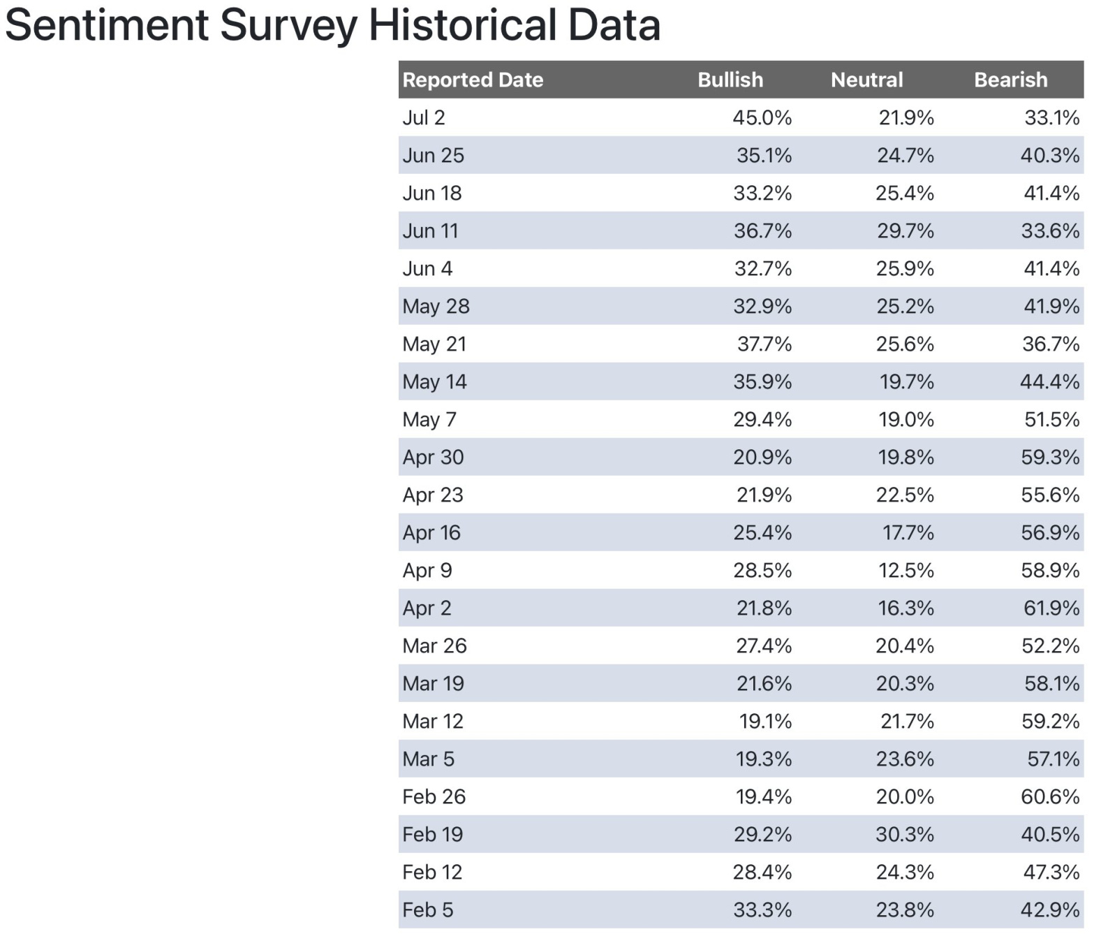
Going back to February, the Bears have maintained a higher sentiment outside of one blip around June 11th.
Net positioning (Aggregate and by day)
Aggregate

At the OI view, Calls are generally equal to puts). Sold calls are not bearish as they’re often sold to provide some hedge to their portfolio (harvest upside volatility premium).
From left to right
OI - Simple OI from Friday morning (just to show magnitude of positioning).
Volm_BS - Today’s volume aggregated by buy/sell
Orientation
Blue = Put
Yellow = Call
Above X Axis = Net Bought
Below X Axis = Net Sold
Volm - Today’s aggregate total volume
Let’s dive into the net dealer exposure for the next week and look at how it looks.

The market looks hedged with the ability to keep going higher. If the market gets a sell off into Monday, it looks likely to be bought up this week.

The above picture is the Options Depth Depth View and shows that market has net sold volatility at the edges (6340C/6100P) and hedged inside for Monday and generally is supportive into the rest of the week. Most of the week so far hasn’t filled out yet so this will change dramatically day/day.
Technical Aspects of the Market
Before I cover key zones to watch, let’s look at some technical aspects of the market.
I like to monitor a few technical indicators that show the percentage of stocks in the SP500 above their moving averages. Each of these show strong price action over the past week(s). Favorable resolution of Tariff deals can obviously propel this market higher while one could argue these indicators are stretched to the upside. Let’s dive into each moving average and see what we can glean.
S&P Stocks above 200D average (S5TH)

Current reading is 61.23 from last week’s reading of 51.09. We’re getting that breadth expansion and this can continue climbing higher as the market continues its tear through July Opex and August. This is important to note as outside of a brief blip around May OPEX, the % of SP stocks over their 200MA has been below 50% since March!
S&P Stocks above 50D average (SF5I)
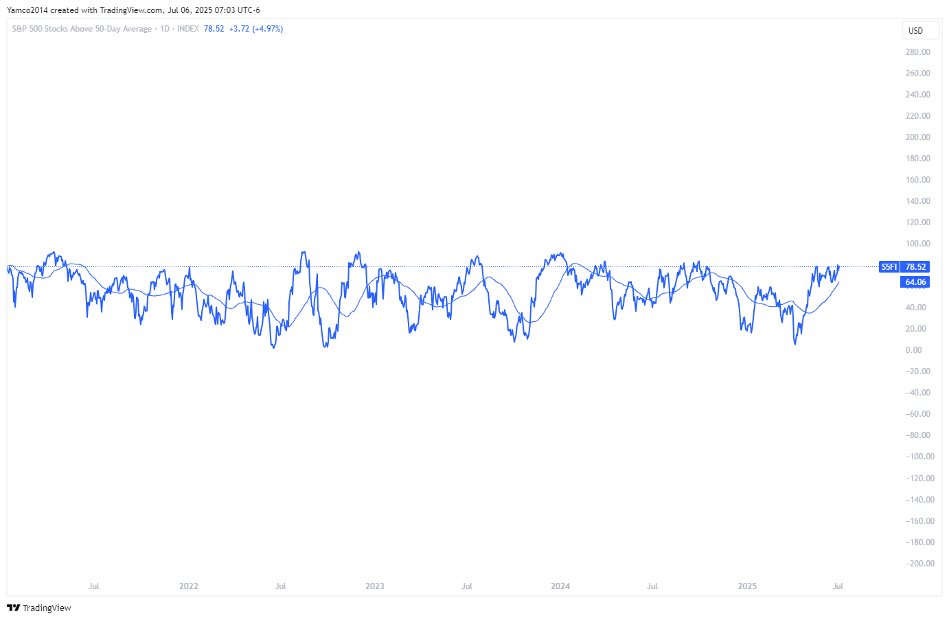
Current readings is 78.5 up from last week’s reading of 70.17. This metric shows a large portion of the market is above the 50D [This metric covers This metric shows a strong market under the hood and not a market led by a select few stocks.Also of note, This indicator has generally peaked over the past 3-4 years around this level.
S&P Stocks above 20D average (S5TW)

Current reading is 80.31 up from last week’s 66.4. I’m not trying to keep repeating myself, but this technical indicator is showing a strong market and breadth expansion. This indicator is approaching levels that have historically marked a top but still has room to go higher.
S&P Stocks above 5D average (S5FD)
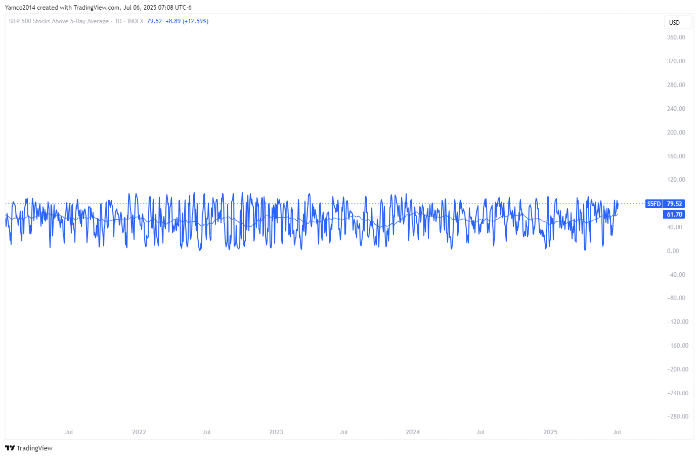
The 5D average metric is near the upper bounds and I generally look at it as a momentum indicator.
Across time frames, the various indicators are showing the market has possibly reached a short term momentum top and a pullback is likely in order. However, I believe there is still room for the market to continue its trek higher.
Total Put/Call Ratio (CPC)

Current reading is .79, down from last week’s .83 and is sitting at the relative low of the past years. I’m sure this week we start to see this metric inflect higher as individuals start buying puts since we’re at ATHs. If this metric continues to drop, then we might need to get a shock to the system to gather fuel to go higher.
Entropy
This is a model built by Machina Quanta ( https://substack.com/@machinaquanta?utm_campaign=profile&utm_medium=profile-page) that captures the disposition of market pricing across time. This model shows entropy continuing to climb higher as the market makes it moves higher. This high increase in entropy indicates the option pricing across the market is highly diversified and the market continues its trek higher as the views are not entirely one sided yet.

Quick reminder on what entropy represents
When most people here entropy, they think of disorder/chaos - that's the literal
lack of order or predictability; gradual decline into disorder.
Entropy was actually used for finding anomalies in EEG readings for cardiac patients. It could detect anomalies (because EEG charts are cyclical) where patients were about to have an imminent heart attack with good accuracy. It comes from the field of signal processing and information theory. It looks for changes in patterns and where a pattern diverges (it doesn't need to be cyclical pattern though...it could be non-cyclical, like an interest rate keeps rising until it blows up the country like Turkish Lira 20 yrs ago). Since, you're a math guy: the math equation is (we use a different variant) -sum[ p(x) log(x)]. <- this is basically, sum up a distribution of finite buckets.
where,
x = the state
p(x) = what proportion of participants are in this state
So, we have a bunch of states - in our case slices of market participants. Some market participants are short a lot, some are long a lot, some are neutral, some are a little short, some are a little long...imagine a spectrum of 10 investors views.
Normal market (each 'state' has a normal or maybe uniform distribution of views) - high entropy, there's no signal as things are going smoothly (i.e., the EEG looks normal, the person is healthy, their heart chart pattern is behaving exactly as it should - no heart attack)
**Distribution of market participant views below**
Normal market
[0.1] [0.1] [0.1] [0.1] [0.1] [0.1] [0.1] [0.1] [0.1]
Abnormal market
[0.7] [0.25] [0.05] [0.0] [0.0] [0.0] [0.0] [0.0] [0.0]
Abnormal market: distribution of states have almost all shifted to one side. In what market scenario does correlation of assets and market views go to 1? The EEG analogy - wow there's a burst in the cardiac chart or wow the amplitude of their readings is much lower than it should be...something is off with their heart. What happens after this is heart attack generally or some physical ailment.
CBOE VIX Volatility Index (1 month forward volatility of VIX)

The 30 day forward volatility of VIX is back to the local lows from last July indicating market expectations on forward 30 day volatility remain very low. This is a metric to monitor and increases to VVIX often surface before increases in VIX. This matters because the market will start to stall and possibly experience a minor pullback if volatility rises.
RSP v SPX
There’s room for some broader SP500 expansion under the hood as the gap between RSP/SPX is at a 1 month high.

If you note something here…. the equal weight to market cap weight move in the index is generally remaining steady at 3% gap give or take for the past 2 weeks which shows that broader market is participating at a near equal pace. If this gap remains similar or closes, the market can continue its climb higher.
Cross Asset Observations
BTCUSD
I covered this two weeks ago but I was looking for a flush on BTCUSD and didn’t capitalize two weeks ago. BTCUSD weakness was realized and a push higher looks probable

These clumped moving averages and strong bid from the identified S/R zone indicate risk on might end up into overdrive… Especially if this upside resistance line is broken (vicinity 109k).
Well… We got the flush and now BTCUSD looks poised to continue higher.
Key zones to watch
In no particular order, we have a few big zones on the chart to watch.
First…. We’re in an environment of high volatility driven by headlines so these levels are going to be wide
From low to high:
5800: China Tariff Pause Gap
5850: EUR Tariff Gap & Weekly 21EMA & 50D/200DMA
6000: Post Election NOV highs
6020: Post June Opex Flag Breakout & weekly 8EMA
6050: Post FOMC early Jan Swing High, FOMC Breakdown
6100: Lower level of ATHs & daily 21EMA
6150: ATHs
6180: Daily 8EMA
6285-6300: Bottom of Channel from October 2023
Let’s Put these on the chart

I’ve highlighted a box of confluence with Weekly Straddle high, This rising channel we’re approach (after losing it in February/March and the next Quarterly OPEX straddle.
Each of these identified levels is a guide to price action to watch into the next week.
They might each cause an extreme response as a squeeze might accelerate or a new sell off might begin.
Tie it all together
Straddles and 25 Delta pricing discrepancy have started to re-expand while we approach the July 9th Tariff deadline and climb into continuously new ATHs
Term Structure shows rising expectations for volatility moving forward into July Tariff Pause and July OPEX. However, term structure remains in the lower range and shifted up from Thursday’s cash close.
Net options exposure continues to look supportive while hedged for a minor correction early this week.
Entropy is at YTD highs with some smaller oscillations which could indicate concerns around a small market pull back. I will note that as long as volatility remains subdued, the market will continue to remain largely supported and buy the dips will continue.
Technical environment shows that the market has seen breadth expansion. While shorter term technical indicators are stretched to the upside, the breadth expansion looks poised to continue which would ultimately keep driving the market higher
As a general risk barometer, BTCUSD broke above the upper resistance and has since retreated slightly back into the consolidation wedge.
Summarizing the above, the market is likely to continue trekking higher barring a continued rise of volatility. Economic data releases and good news on the Tariff front will likely be the catalysts to continue propelling the market higher barring unforeseen shocks. All this to say, a brief consolidation phase would be healthy and a pullback looks poised to continue a move higher into July Opex - likely in yet another “V” pattern.
On to the position updates, and trades I’m watching.
Keep reading with a 7-day free trial
Subscribe to Yamco to keep reading this post and get 7 days of free access to the full post archives.