


Review of Positioning Metrics

Revision Table
<02/02> - identified and corrected an error in the dealer long/short delta/gamma table and corrected it. Added additional information into how this data (in isolation) is applicable to short term price action
<02/07> Added section on details of the SPX trades and how to trade them.
<03/28> Added section at bottom of common terms
<06/10> Added Section 8: Options Depth Graphics
<06/16> Added DX & GX Surface Explanations
<06/19> Added Explanation of some output from my scanner
<06/27> Added Explanation of Gamma/Charm Heatmaps and what they represent
Article Start
This article is a detailed explanation of all the graphs/charts/tables I post around positioning explaining the nuances of each and ultimately how to tie it all together.
Topics in this article include
Straddle Pricing and what the graph/numbers represent
What is a volatility curve and how can one use it
What is skew
Positioning Tables
Daily Map (Often referred to as Path of Least Resistance)
DX & GX Surface
Flow Tables
SPX trade methodology
After reviewing those topics, I’ll tie it all together on how I view trade entries and where momentum can pick up.
Straddle Pricing
The idea of straddle pricing is simple - the seller of a straddle is predicting that price for a certain time period is contained within a set range. For an At the money straddle (red numbers), the seller (as of Monday close), expects the market to move less than 63 pts in any one direction for Wednesday 1/29/2029.

First the data is grouped by dates and the explanation of the numbers is below.
Red (On Bottom) is the combined price (as of close on Monday) of the at the money (closest strike to close) call and put combined.
Wednesday (1-29)’s Straddle is 63 pts - This is priced off Monday’s close 6012.29. That means the straddle range is +/- 63 pts for a range of [5949.29,6075.29].
Inner yellow/blue Ranges
Before I cover what these ranges represent, I’m going to do a quick primer on delta: Some think Delta is solely the increase of your option per 1$ change in the underlying. It’s that and also the probability that the strike ends in the money (spot > strike for call or spot < strike for a put). So… a .25 Delta put option is an option that the Black Scholes Formula says has a 25% chance of expiring in the money.
The inner yellow and blue lines represent the 50% range derived from the .25 delta call and .25 delta put. The gray value in the very middle represents the sum of those. Notice how the put (57.77) is greater than the call (49.44). However, their combined range is the gray value (107.21). The .25 delta options are more expensive for the puts!
So to understand these ranges, consider this… If a 25 delta put and call represent strikes the market is pricing as 25% chance of being in the money (50%) combined, that is the 50% range. If you consider a 15 delta put and call option, these options have a 15% chance of expiring in the money. So the range between them is 70% and is thus representative of the 70% range.
Outer Yellow/Blue Ranges
These ranges represent the cumulative distance of the .15 delta from spot. To get the total call distance, you add both yellow numbers (24.28 and 49.44 for 73.72). To get the total put distance, you add both blue numbers (57.55 and 34.82 for 92.59). If you add all four of these numbers, you get a Black Scholes derived range of 166.31.


I’ve taken the data above and summarized it on the following picture. Reminder this table is as of Monday close for FOMC day (1/29/2025).
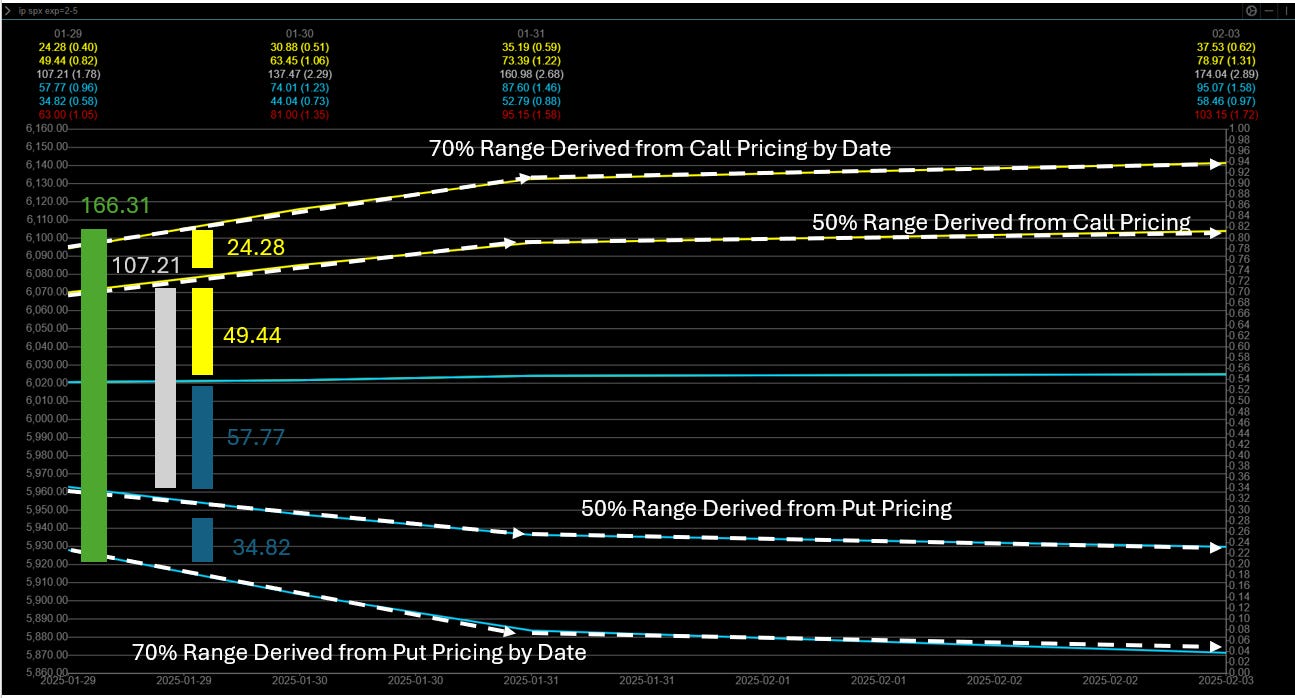
To summarize Wednesday 1/29/2025 as of Monday (1/27/2025)’s close, the market is pricing in an expected move of 63 pts [5949.29, 6075.29] from Monday’s close, a 50% chance it moves under 107.21 pts [5954.52, 6061.73] and a 70% chance it moves under 166.31 pts [5919.7,6086.01].
I know it’s a lot of numbers, but there is a lot of data contained in this one piece of information.
Volatility Curves & Skew
This one might seem the most complicated but is actually relatively straightforward
Volatility curves plot the implied value for a given expiration against strikes for both puts and calls.

Yellow Line = Call IV
Blue Line = Put IV
The example above is IBIT 0.00%↑ or the BTC ETF. Note that the call IV is higher than the put IV across the next 6 expiration dates ( 01-31-2025 > 03-07-2025).
Why does tracking volatility matter? Well… Implied volatility affects the pricing of the option and as more and more people buy options, implied volatility increases. Conversely as more and more people sell options, implied volatility decreases. This increase or decrease in options pricing is characterized in “vega”. Your broker might show it in a quote dashboard. These volatility curves show you how IV changes as you go away from the current spot in strikes across a fixed expiration date (In the picture above). How do I look at volatility increases/decreases, simple - volatility curves show increased (or decreased demand) across an expiration date on the entire curve of calls/puts.
Before I continue, I’m going to bring up Skew and explain the key differences
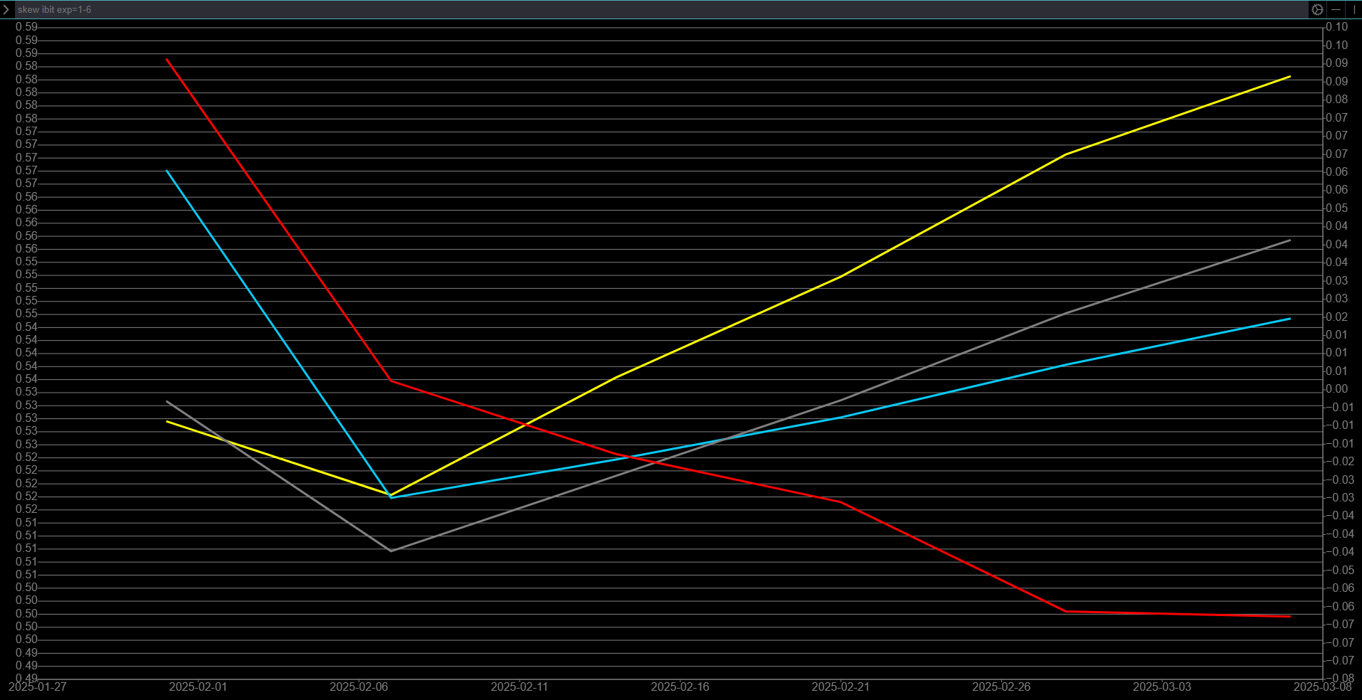
This chart above is also for IBIT 0.00%↑ , do you notice anything similar between the two? Yellow (Call IV) is greater than Put IV for all future dates and you can see skew decreases across expiration dates. This graph just shows you the relative OTM IV for positions (same idea as volatility curves) but the primary use for skew is to show you IV for relative distance strikes (so a .25 delta call v a .25 delta put) vs the full picture of volatility across a range of strikes as the volatility curve does.
Positioning Tables
If you ever wondered how to read this table, let’s go through it

Left Table: VannaOi
On the left you have the VannaOI table - Essentially looking at open interest of whatever time period (in this case it’s Wednesday) and what the impact of vanna (2nd order greek that measure the sensitivity of an option’s vega (volatility change) to changes in the underlying’s delta). To simplify that statement, how will hedging (or probability of being in the money) change as volatility shifts.
Middle Table: Volume Table
Pure Volume on the various strikes with no netting out. It’s just a representation of active strikes.
Right Table: The Buy/Sell Netted Volume Table
This table shows you which strikes are aggregate buys or sells and helps you identify what options nodes are important. Remember, these option nodes act as magnets where it attracts and then repels (the repelling nature is a byproduct of algorithms selling positions at key nodes and the hedge being released. I can go into mechanical bounces in a further education article if that’s requested).
Daily Map
There’s alot on this so I’m going to take a map and copy and paste it a few times to highlight all the pieces of information.
This map is as of close on Tuesday 1/28/2025 For Wednesday 1/29/2025

First - these numbers in the top right show the relative hedging pressure on moves going up or moves going down

So there’s more upward pressure keeping SPX from moving up too quickly.

This black band is referred to as the path of least resistance - It’s the calculated path based on hedging factors (including charm) to the market close. Essentially, without any change in positioning, this is how the market will move for dealers to remain hedged. The green area represents an area of lower delta so market makers will inject liquidity in this area as part of their hedge strategy. Conversely, the red area represents an area of higher delta so market makers will remove liquidity in this area as part of their hedge strategy.

Purple = Delta
Blue = Gamma
These two graphics here represent the dealers 0DTE gamma and Delta profile (Left) and dealers overall gamma and Delta profile (right) for all expirations. There’s some nuances here around how the dealers are net long/short calls/puts are various combinations of Positive/Negative Delta/Gamma.
Combinations
Positive Delta, Positive Gamma - Then dealers net long calls
Negative Delta, Negative Gamma - Then dealers are short calls
Negative Delta, Positive Gamma - Then dealers are long puts
Positive Delta, Negative Gamma - Then dealers are short puts
These positioning combinations detail what options are “most significant” in terms of the hedging plan.
DX and GX Surfaces
DX Surface
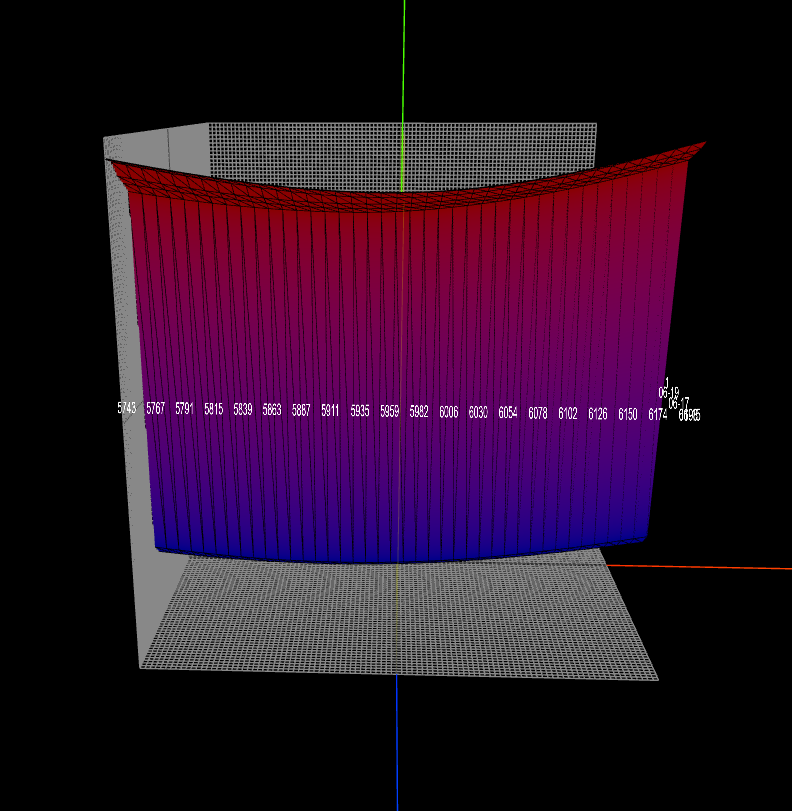
DX Surface shows cumulative Deltas from the dealer perspective across time (this cross section is cumulative impact for today).
Generally speaking, sloping down = dealers are supportive the price (adding deltas) while sloping up = dealers are suppressing the price (removing deltas).
GX Surface
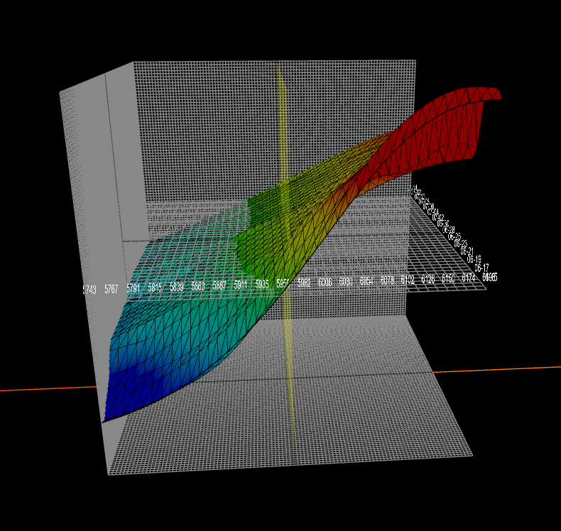
GX Surface shows the cumulative Gamma at time and price for the entire OI in the chain at a point in time (I believe this is updated twice daily). This surface shows the cumulative gamma for today and into the future across spot prices.
<Added as of 2/2>
All long options have positive gamma so conversely all short options have negative gamma. Deltas are either positive or negative based on how the options price changes as the underlying moves.
Let’s do a quick review of how a singular option long/short option could impact PA given the dynamics above.
Consider the following scenario - Note, this is from the perspective of an investor so the table above will need to be flipped.
An investor is long 0DTE calls (dealer is short calls) with a strike of 600 and the current stock price is 599 (1 dollar apart), Assuming the dealer is hedged with simple long/short of the underlying, as the price increases from 599 to 600, the dealer would have to buy 1 additional gamma of the underlying (to remain hedged). As the underlying is now equal to the strike price of the option (600=600), one can make an assumption that the delta is approximately .5. If the investor then sold this call at this point in time, what happens to the dealer’s 50 share hedge? They no longer need the 50 share hedge and thus sell this hedge. With extremely small option concentrations, the impact to price would be meaningless but with extremely large volumes, price could have a significant reaction as an assumed hedge of 50 shares per contract are now being <instantaneously> sold into the market. This dynamic is being oversimplified for this example but is the reason why prices “jerk” in directions as options close.
Flow Tables
Two different views here - They’re essentially the same information just presented in a different format.


The singular table (first) and the left table (in the picture with two tables) are the same information and is a spatial view of the far right table discussed in <Positioning Tables>.
How do I put this all together
Day trade using Map
Take the 6055 Reclaim posted in chat today (6055)

At the time, of posting this, we have this map.

This maps shows we are in a hedged market and that the path indicates a grind into 6065 (end of day). It’s likely that we turn here as we are supported by dealers below (Green area). The market has also shown us the important of 6055 as it has reacted here several times during teh day.
As we approach the edge of a straddle (weekly or daily), I’ll consider net positioning at key strikes to find areas price reversion might occur.
For swing trades, I look at all the pieces above
Does Volatility curve show a unified upwards view across expiration dates (More traders are looking for upside)
Is the positioning supportive of a move upwards (are institutional traders seeing the trade the same way as I am)
Does the chart look like a positive technical pattern - This is entirely subject based on time frames and how you want to draw it.
Hope this article helped make sense of how I view positioning - If you have questions, please post them below. I will edit this article below here to address them for further clarity.
SPX Trading Methodology
Let’s start off with a general primer on the trades which I post in the daily discussion thread.
These setups generally look like this

How do I identify the levels?
These backtest (comes from above) or reclaim (comes from below) levels come from my BMO (Before market open) snapshot of 0DTE positioning from ConvexValue and other information like daily straddle, net dealer positioning (This is that map with green and red separated by a black band) - You might hear me reference the “path of least resistance".
How do I play the levels
The theory of how to play these levels is simple, but can take a bit of time to fully understand the price action needed to execute the levels so let’s dive in with three examples. First two are the backtest trade and 3rd is the reclaim trade.
Three steps must take place for a backtest trade to be valid.
Test the level and bounce
Backtest the identified level (and go through it)
Price must reclaim the highest bounce from the first step for entry
Example 1: 02/07/2025 6065 Backtest

1004 EST, We got a series of two successive drops from 6100 that landed us at our level of 6065 with a near immediate bounce to 6075. This mechanical bounce DID not have a backtest to 6065 or “bull/bear battle at 6065”. Thus this trade is not yet valid. You must see buyers and sellers fight it out. This means you want to see the price dip under and pop back over the level of 6065. 1008AM EST, SPX wicked at 6076.5 and 6076.5 is now my entry price if we get a backtest and continuation higher. Why? Sellers stopped the price from going up at this point (6076.5) and one can assume that sellers remain here. So until we get through this level, sellers are in control.
First step complete
1013 EST, SPX went down and backtested 6065 (GOOD) and continued down to 6058.
Second Step complete
SPX then reclaim 6065 at 1022EST and chopped for 31 minute until a tariff tweet sent us crashing lower for the day. The price action never reclaim 6076.5 and thus an entry was never provided.
Third Step Failed
Example 2: 02/05/2025 6015 Backtest

1003 EST, We got a drop that sent us below 6015. 1010 EST, we had our first test of 6015 from underneath. 1013 EST, we broke through and made a local high at 6020.13 which is now the entry level.
First step complete
1016 EST, SPX went down and backtested 6015 with a short dip under (GOOD).
Second Step complete
SPX then breaks through 6020.13 (identified in step 1) at 1022EST which was when I entered. My exit predetermined as a loss of 6015 with predetermined targets at 6025, 6030, and 6035.
Third Step Complete
I manage my exits systematically using 50/20-30/10-20/runner above). On this particular trade I had 1 DTE calls and followed a 50/20/20 with subsequent 10% runner profit system (I trailed out of my final positions at SPX 6046 at 1219 EST).
You might ask why I scale out of my positions on the way up, it’s because at any moments notice, this trade can turn south and I at least have some profit locked in.
Options Depth Graphics
I’ve felt that OptionsDepth has generally provided an additional edge at how the market is positioning and how it might react given it shows a representation of dealer net positioning every 10 minutes.
Charm Profile (This exact graphic is from 11am EST on 6/10)

Quick Orientation to Charm
Charm represents the change in delta with respect to time or how delta will transition to +1 (ITM calls), 0 (OTM options) or -1 (ITM puts) as the day progresses.
From Options Depth, “When charm is positive, market makers hedge by passively selling the underlying to rebalance their options portfolio, creating a suppressive charm effect. Conversely, when charm is negative, they passively buy the underlying to rebalance their delta exposure, resulting in supportive charm. While the magnitude of these effects is often mild, they often become more significant near the end of a trading session.”
How to use
In the graphic above, Orange = positive and Blue = Negative.
If you notice in the graphic above, Price was in a narrow band of supportive charm with selling pressure above and selling pressure below spot (annotated with red arrows for selling pressure and buying pressure annotated by green arrows).
Understanding the Values
The Charm Heatmap shows the delta per 5 minutes of time. If you multiply the charm number by -2 you get the required number of ES contracts required per 5 mins.
Gamma Profile (This exact graphic is from 1220 EST on 6/10)
Quick Orientation to Gamma
Gamma represents the hange in delta exposure relative to shifts in the underlying price - Reactive measurement of hedging changes.
From Options Depth, “In high gamma environments, market makers trade against price movements to hedge their portfolios. This often results in reduced volatility and more compressed price action. Peaks in gamma exposure frequently coincide with potential support or resistance levels. On the other hand, negative gamma environments typically lead to increased volatility.”
How to Use
This graphic shows the aggregate gamma peaks (green) and troughts/valleys (yellow). I don’t post this very often but reference it constantly for my commentary but from the note above - the Green lines represent peak dealer gamma in price/time and are often a firm resistance..
Understanding the Values
The values are measured in aggregate delta units. For the gamma heatmap, the unit of measurement is delta per 2.5 point move in SPX. A value of 300 here means MM’s would have to buy 600 ES contracts per 2.5pt move. Recall that SPX options are 100x while ES is 50x, so you need to multiple by 2! You can multiple the value in the Gamma heatmap by .8 to find the ES contracts required per minute (2/2.5) vs every 2.5 Minutes.
Dealer Net Positions (This graphic is from 1300 EST on 06/10)

Quick Orientation to Net Exposure
I focus on the MM (Market Maker) side of options flows since MMs are going to react to their net positioning in what should be a predictable pattern
From Options Depth, “
MM Long Options (regardless of contract type): When customers have negative net options positions, market makers have a positive position, resulting in positive gamma exposure. They hedge against price movements, creating support and resistance levels
MM Short Options (regardless of contract type): When customers have positive net options positions, market makers have a negative position, resulting in negative gamma exposure. They need to hedge by selling as the price increases and buying as the price decreases, amplifying market movements.
Positive Gamma acts as S/R due to MM’s hedging activists against price movements.
Negative Gamma acts like magnets amplfying prices in the direction of movement increasing volatility.
How to Use
This graphic helps us identify areas (like 6000) where MM hedging activity is going to act as support or where upside positioning is going to act as a ceiling. On the flip side, the negative gamma is where acceleration is likely to occur. I use this as a guide against S/R zones on ES/SPX to guide how I see A+ Setups on the indices.
Screener Explanation
Premium/Volume Multiples
Let’s take a step back and consider many of the single names I’ve highlighted and traded have been on the back of outsized flows. I came up with this idea last spring and actually talked through it a bunch with
and . I met them in another substack and chat with them from time to time.This scanner isn’t really meant to pick up the trades like I’ve flagged on ARM 0.00%↑ whereby the ARM 2027 call buyer spends 10M a day. It’s meant to pick up odd flows across the market for pretty much any name with an option chain by comparing daily flows against a rolling average.
Let’s take a look at a few examples that have worked out great
ACHR 0.00%↑ from September


First hit on 10/16 (ignored at the time)

2nd hit on 10/23 [When I wrote the trade]

The rest is history….
Consider KTOS 0.00%↑ back on December 4th [These flows were nearly 13x average]
Most people wouldn’t notice these flows as they’re ~850k. Everyone was obsessing over NVDA’s 80M Mar 2025 calls coming in daily (satire a bit).


We’ve bought and sold it twice but it’s up ~60% since those flows.
On 11/19, I posted the trade to go long

These flows were like 11x daily after several days of 3-5x.


Stock rallied 13% in 2 weeks and ultimately 22% in short order before collapsing bsasically back to the same spot price.
Net Delta Scanner

This is a similar approach to the above prem/vol multiple but using option delta from a fixed starting point on Ticker/Expiration date combinations vs cumulative view at the ticker level.
The basic premise of this scanner is akin to the deltas from ConvexValue (I created this scanner before I start using ConvexValue).
When the transactional deltas undergo a large increase at the Ticker/EXP combination, I grab it into a giant database. I have it captured for decreases as well but that’s been largely unfruitful as nearly every trigger on that scanner is profit taking on calls that were bought weeks/months ago.
Explanation of the scanner
Ticker: self explanatory
N: Number of unique ticker/exp combinations that triggered
asof: day it's ran
exp: self explanatory
Delta: Today's net delta
Cumdleta: Additive delta from fixed date
CumDelta_t-1: Previous cumulative delta
Increase - cumdelta/cumdelta_t1 - 1
Net Pos # - transactional level information for the 3 largest delta increase positions
gross pos # - all volume for those 3 largest delta position increases
Excellent job on this and for the updates, love it!
This is an article to be read and re-read. Thank you Yam for going into such great detail. You are teaching to fish for ourselves and there is no greater gift :)